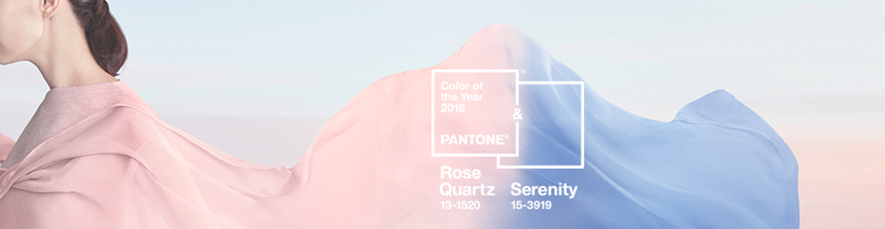
 In 2016, Pantone decided to change it up by offering two stand out colors of the year. According to Pantone, the two colors of the year, Rose Quartz and Serenity “demonstrate an inherent balance between a warmer embracing rose tone and the cooler tranquil blue, reflecting connection and wellness, as well as, a soothing sense of order and peace.” Pantone explains that a direct correlation between consumers seeking mindfulness, reassurance and security were the reasons for selecting two colors to represent 2016. Specifically, these two colors together are being used interchangeably by the genders represented in fashion trends. Using a soft rose and sky blue to denote gender equality is yet another reason for supporting the blend of these two colors.
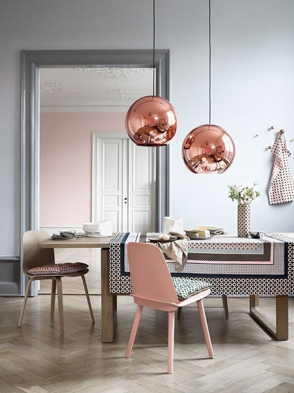
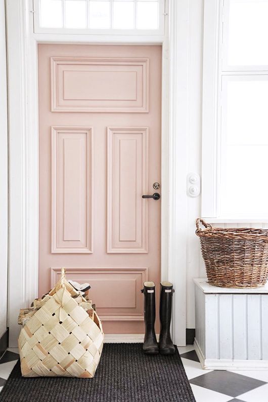
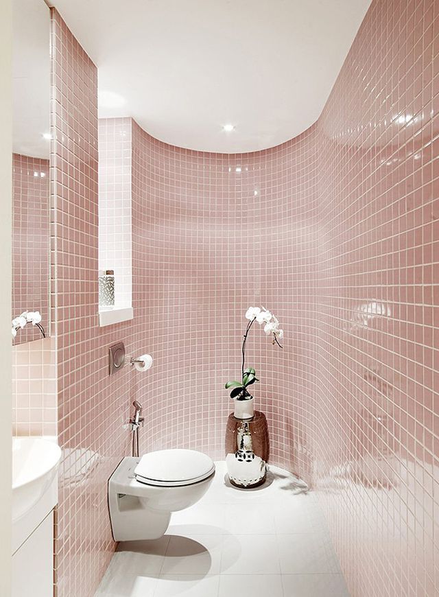
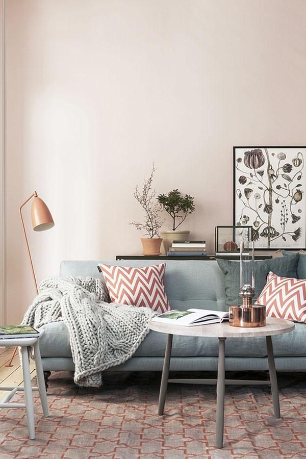
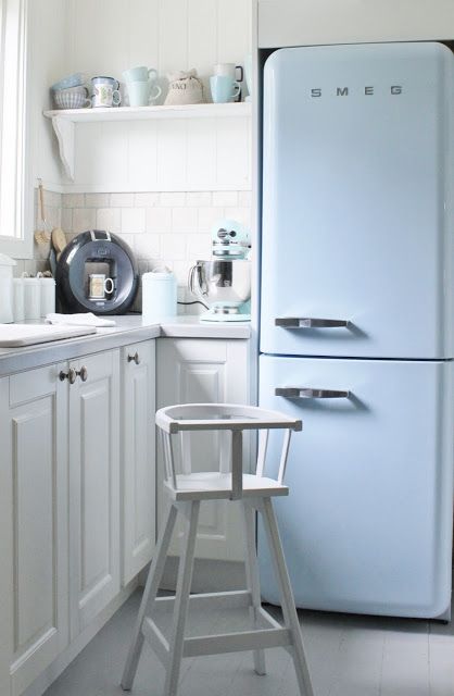
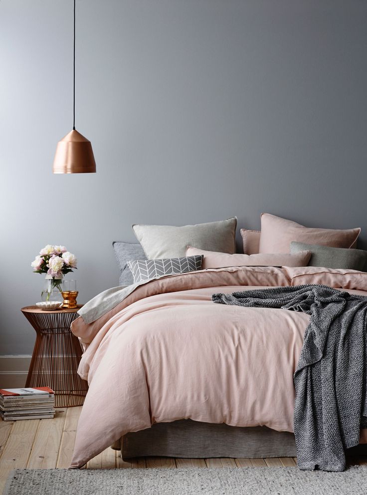
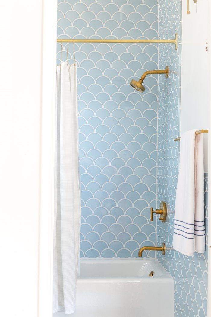
Because of the subtle nature of the colors Rose Quartz and Serenity, decorating can easily be paired with a myriad of colors like grays, taupes, greens, teals and more to create a soothing effect on the feeling within your home. Maybe these colors are too pale and feel like they belong in a baby’s room, but if you let your mind open to the potential of these colors you can extend these colors throughout your home. Their easy nature and classic feel can also include a sense of calm in a house that may have a lot of activity. Their classic nature can enhance a room by adding an elegance to a living room or sitting area. Or using the whimsy aspect of these colors can add some lightness or fun to a room that might be too stark. For more inspiration, we curated these photos to help you get inspired to use the 2016 Pantone colors, Rose Quartz and Serenity, in your home.
One Response to “Decorating with the 2016 Pantone Color of the Year”