Every year the paint manufacturers review what colors really stand out and remark on what they think the color of the year is for the upcoming year. This year the paint manufactures are looking at all different types of color to showcase mood, feelings and design. Each one of the paint companies is focused on a different look and feel that they think will become popular with homeowners and designers. Let’s take a look at which paints are making their mark for 2017.
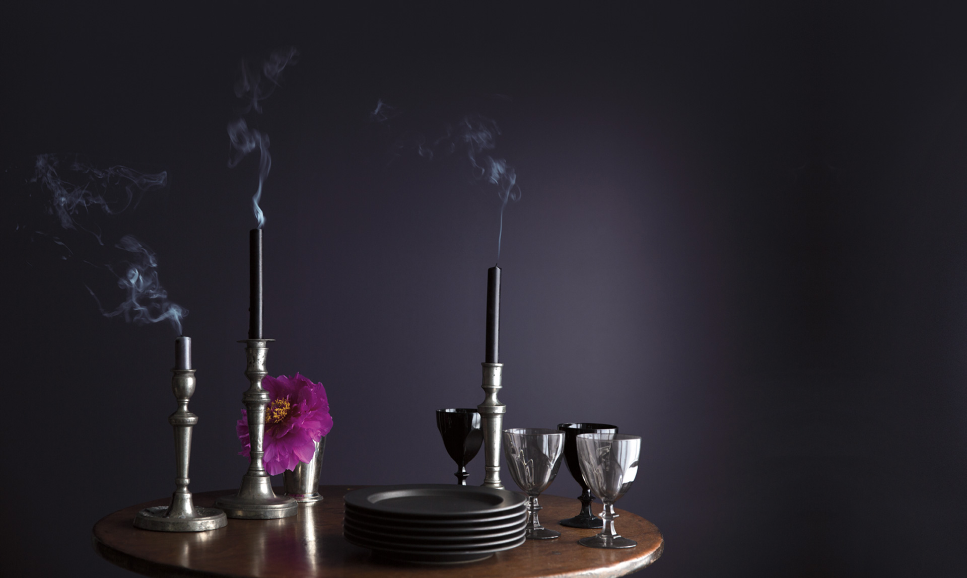
First up is Benjamin Moore and their desire to go bold and yet serene with an aubergine style color called Shadow. The explain that this color was selected because it represented an artistic solution offering a saturation and yet a regal feel to the rooms and spaces that the selection team visited. Shadow offered a sense of nostalgia and memories because of the lighting on the walls that wore this color. This color also created depth and a proportion to space that the team felt was necessary and a different feel from last year’s color selection of Simply White.
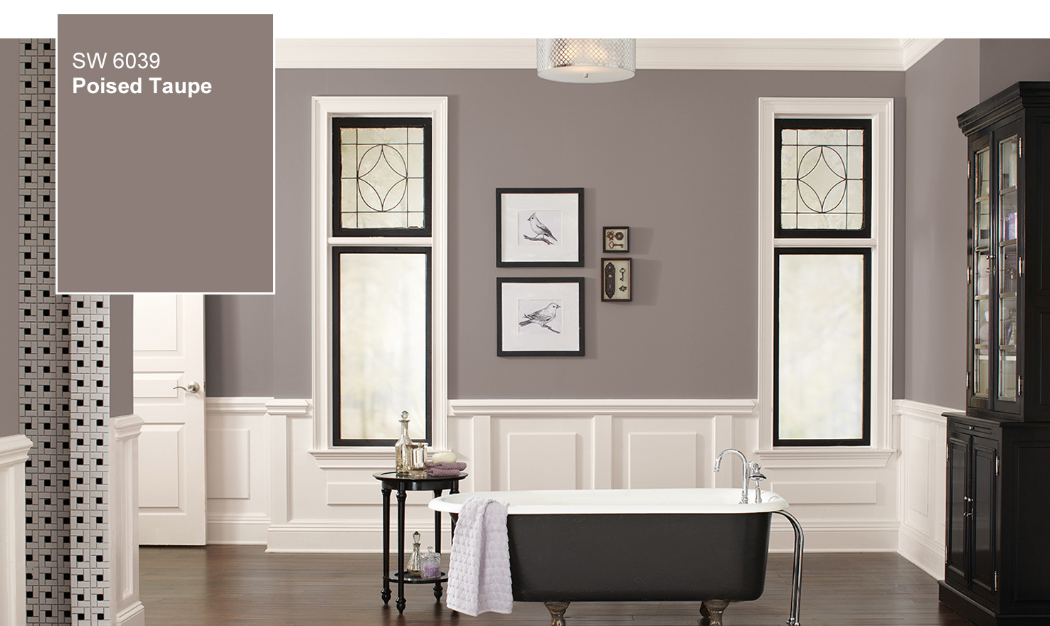
Next, we take a look at the color Sherwin Williams is suggesting as the color of the year. Sherwin Williams is taking a different stance on color and has selected Poised Taupe as the hot color for 2017. This team wanted to showcase a coziness and timeless age that brings out the feelings of warmth in a home. This team also feels that nostalgia plays a role with this color as Poised Taupe has the ability to show case the care of a home and the family that lived in it. Poised Taupe combines earthen browns with Conservative grays to create a casual elegance.
The team at Dunn Edwards paint has decided that their selection for 2017 is Honey Glow. Dunn Edwards also is looking at introducing warmer colors back into the palettes of homes. But do not be surprised, this color is still very bold and can add depth to any room. In addition to naming their color of the year, proceeds from the sale of Honey Glow will be sent to a nonprofit organization to support urban honey bee management and education to help protect the honey bee called Honey Love.
Pittsburgh Paints is suggesting a slightly different color of the year, Violet Verbena. It was a tough choice for this team but one they take seriously and go through an intensive process to find what they feel will be trending. Violet Verbana gave a modern feel to color but one that was retrospective according to the team. This color is a balance between masculine and feminine, old and young, fresh and dated, and work and leisure. Balance was a critical element in selecting this color.
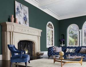
Pratt and Lambert decided on a green hued color for their 2017 color of the year. Leafy Bower is a color the team felt indicated glamour and created an energy in a room. This color like the Pittsburgh Paints Violet Verbena was set out to evoke a duality or convergence of colors and moods. The idea that blurs categories like day and night and modern and traditional. Leafy Bower incorporates a lot of hues to come to the green color that Pratt and Lambert feel is the color of the year.
These colors each have palettes that each paint manufacturer recommends matching these colors of the year, however if you see fit, mixing and matching these amazing colors of the year may work well in your home.