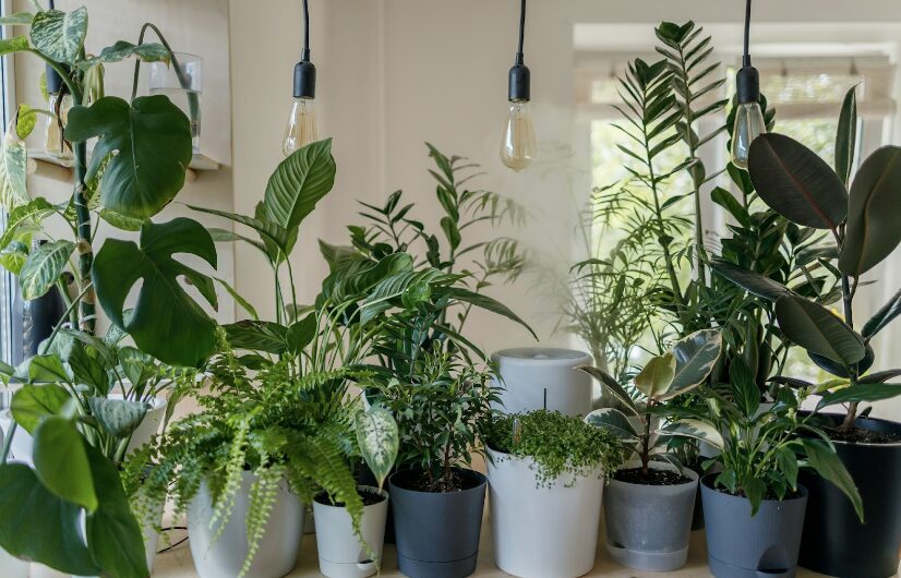
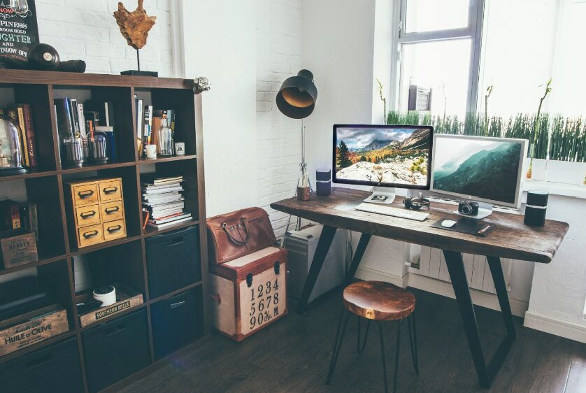
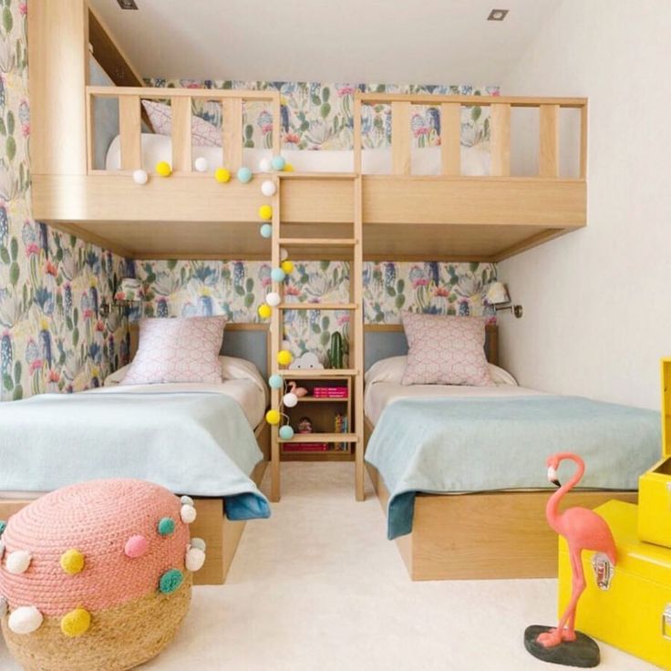
For many people, days are spent rushing from one place to another, checking items off an endless to-do list, and taking care of everything from the job to the kids. When the day is over, your home should be a place to unwind and relax. If your home is another source of chaos and stress, here are 12 ways to create a relaxing atmosphere.
Read MorePocket Offices: An Increasing Trend in Home Office Design
Over the years, the way we work has changed significantly. Remote work has become more common than ever. As we adapt to this new way of working, “pocket offices” are gaining in popularity.
This home office concept offers a practical solution to the challenges of working from home.
Read on as we discuss pocket offices, what they are, their benefits, and how to use one to create an efficient and productive workspace in your home.
Read MoreKickstart Your Year with a Tidy Home: Easy Tips for New Year Organization
If one of your resolutions for this year is to get more organized, the following strategies and insights will help you leverage the motivation that often accompanies the start of a new year.
By reflecting on the past year and setting achievable goals, you can create a more functional living space, helping you knock that resolution off your list!
Read MoreAre You Thinking About Painting Your Home?
If you are thinking about painting your home this year, here are the new colors of the year by each paint manufacturer. Each manufacturer has chosen a different color to give you a variety of choices if you are considering color palettes.
You may or may not be familiar with all the manufactures we are mentioning, and you may not be familiar with the color of the year concept. The color of the year concept was started by the color company Pantone. Pantone creates colors for the design and manufacturing industries. These industries include graphic design, fashion design, paint manufacturers, product design manufacturers and others.
The Color of the Year
The color of the year started in 2000 with the Pantone Color Institute declaring a color of the year by hosting representatives from various nations to determine the actual color of the year and reasoning for the color of the year. You can learn more about the past colors of the year here.
Pantone Color of the Year
Pantone’s color of the year is Peach Fuzz. They want to invoke warmth and calm with this color. Peach Fuzz is designed to nurture ourselves and others. When you look at this color, you can see the calming effect. The color also looks a bit ethereal bringing in love and light to the area in your home.
Sherwin Williams Color of the Year
Sherwin Williams is on the same concept of light and calming with Upward which is a light airy blue color. Sherwin Williams takes the step a bit further by showcasing additional colors that could accent or go well with their color of the year choice. These are also calming colors and you now have more choices for colors in your home.
Benjamin Moore’s Color of the Year
This manufacture chooses a different color but with similarities to Sherwin Williams with Blue Nova. Blue Nova is a bit darker than Upward but is still soothing. Benjamin Moore was inspired by travel to come up with the Blue Nova color of the year. They also share colors that align with this color in order to help you plan your spaces.
Behr’s Color of the Year
Behr choose to go a completely different direction with Cracked Pepper. This color is dark and rich. It is exactly what you think, it is a black color and brings a boldness to a room. For anyone doing video production in a room, this is a great color for a wall.
Dunn-Edwards Color of the Year
Dunn-Edwards is also choosing a blue color with Skipping Stones. This color is inspired by the sea and feelings of gratitude and magic. They suggest using this color in a space for quiet reflection.
Valspar Color of the Year
The Valspar organization is also choosing a blue color for 2024. This color is called Renew Blue. This organization is also inspired by calm and serenity in the home. They also use the word simplicity to explain the reasoning behind this chosen color.
HGTV’s Color of the Year
HGTV in partnership with Sherwin-Williams has created a similar color to the Pantone color called Persimmon. Persimmon is a peachy like color similar to that of a persimmon fruit.
Glidden Color of the Year
Glidden stays in the same calming color scheme but chooses a more yellowish color with Limitless. They may not like the fact that I called it a yellowish color, you can watch the video for more fun, but it kind of looks a little yellowish to me.
Remember painting your home or objects in your home can use these colors. You do not need to use these colors on all the walls in a room but any of these colors could be a great accent wall. Have fun and it is looks like calming is the core message for 2024.
The Power of Color: Benjamin Moore’s Paint of the Year and the Psychology of Design
Refreshing Your Laundry Space: 4 Things You Need to Know
Dread walking into your laundry room? It could be a sign that your laundry space needs a good refresh – or a complete remodel.
If you’ve decided enough is enough, and it’s time to change up the space, read on as we explore the essential elements of designing a functional and aesthetically pleasing laundry room.
Read More