With the year in full swing, the paint companies have established their suggested 2025 colors of the year. Some of these colors are bold and rich while others are a bit more subtle. Another trend we are seeing is that many of these companies are now offering full palettes of color to better help homeowners and designers make decorating decisions with a complete set of colors that work well together to ensure a complete design.
Read MoreAre You Thinking About Painting Your Home?
If you are thinking about painting your home this year, here are the new colors of the year by each paint manufacturer. Each manufacturer has chosen a different color to give you a variety of choices if you are considering color palettes.
You may or may not be familiar with all the manufactures we are mentioning, and you may not be familiar with the color of the year concept. The color of the year concept was started by the color company Pantone. Pantone creates colors for the design and manufacturing industries. These industries include graphic design, fashion design, paint manufacturers, product design manufacturers and others.
The Color of the Year
The color of the year started in 2000 with the Pantone Color Institute declaring a color of the year by hosting representatives from various nations to determine the actual color of the year and reasoning for the color of the year. You can learn more about the past colors of the year here.
Pantone Color of the Year
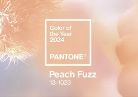
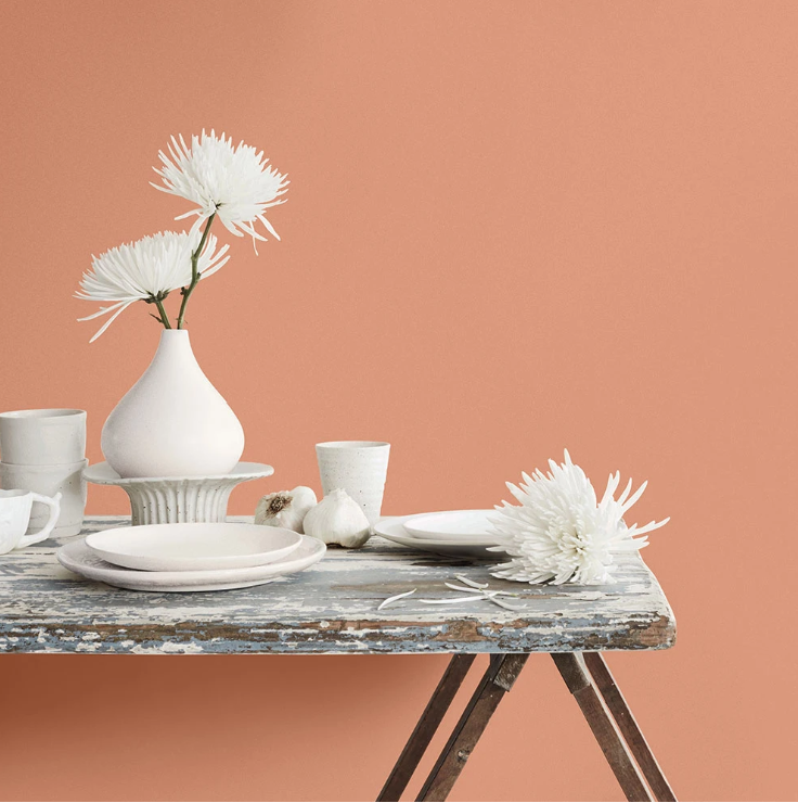
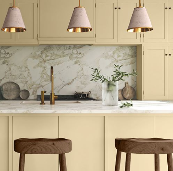
Pantone’s color of the year is Peach Fuzz. They want to invoke warmth and calm with this color. Peach Fuzz is designed to nurture ourselves and others. When you look at this color, you can see the calming effect. The color also looks a bit ethereal bringing in love and light to the area in your home.
Sherwin Williams Color of the Year
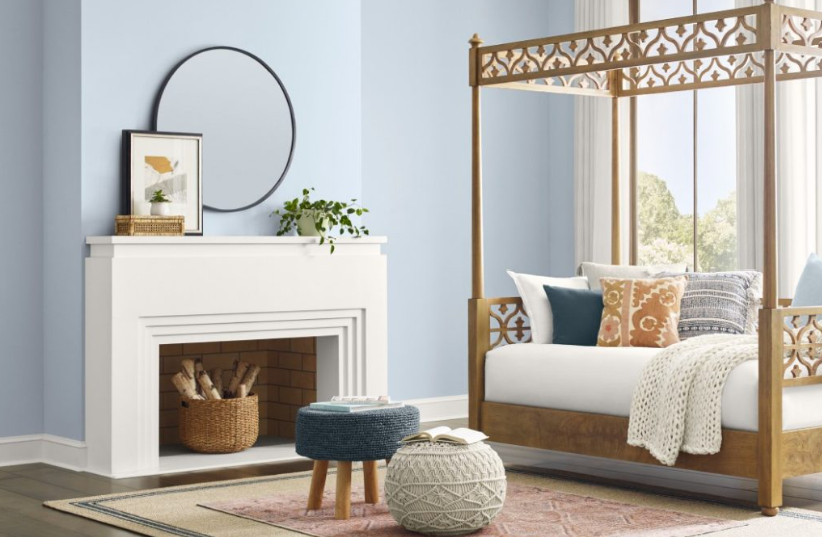
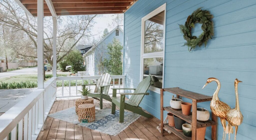
Sherwin Williams is on the same concept of light and calming with Upward which is a light airy blue color. Sherwin Williams takes the step a bit further by showcasing additional colors that could accent or go well with their color of the year choice. These are also calming colors and you now have more choices for colors in your home.
Benjamin Moore’s Color of the Year
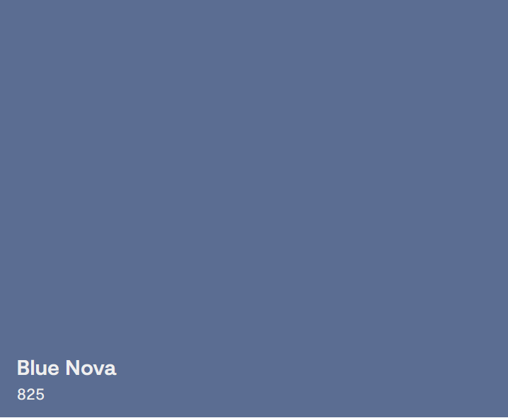
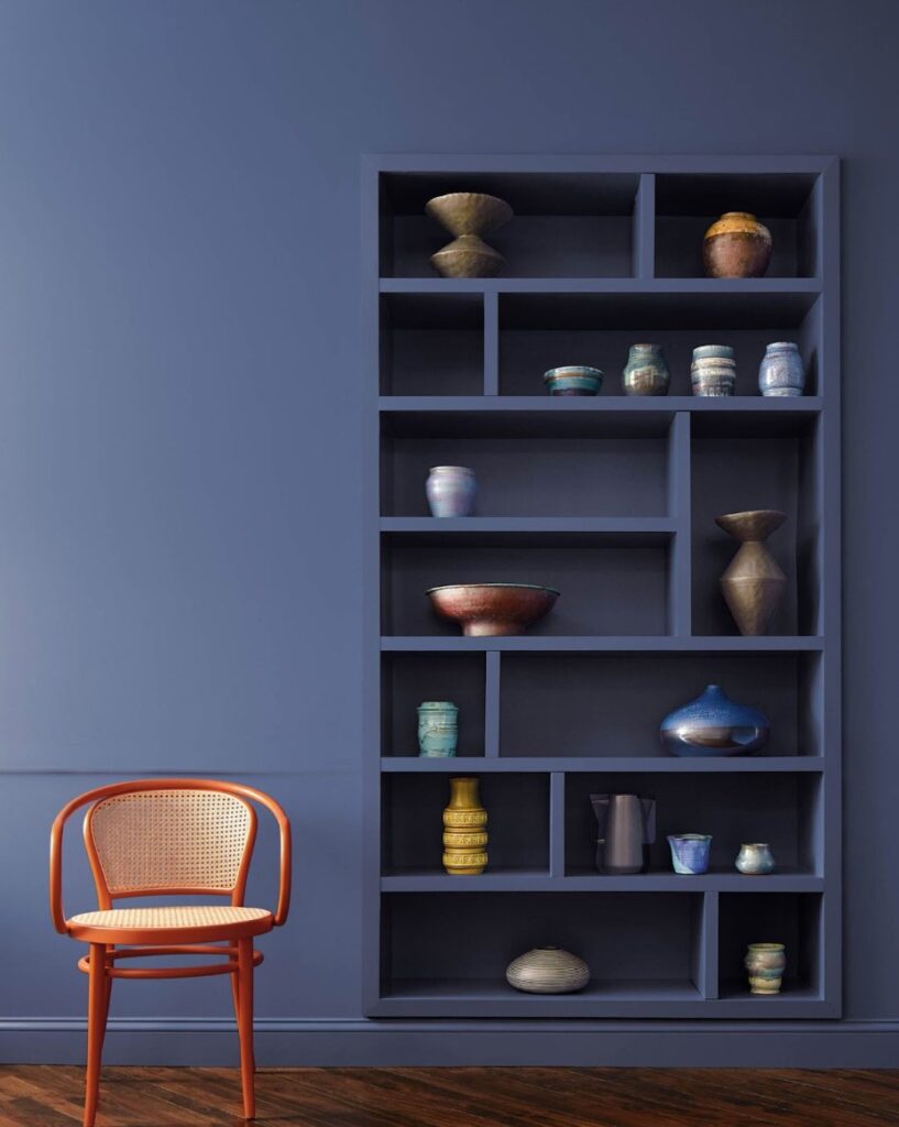
This manufacture chooses a different color but with similarities to Sherwin Williams with Blue Nova. Blue Nova is a bit darker than Upward but is still soothing. Benjamin Moore was inspired by travel to come up with the Blue Nova color of the year. They also share colors that align with this color in order to help you plan your spaces.
Behr’s Color of the Year
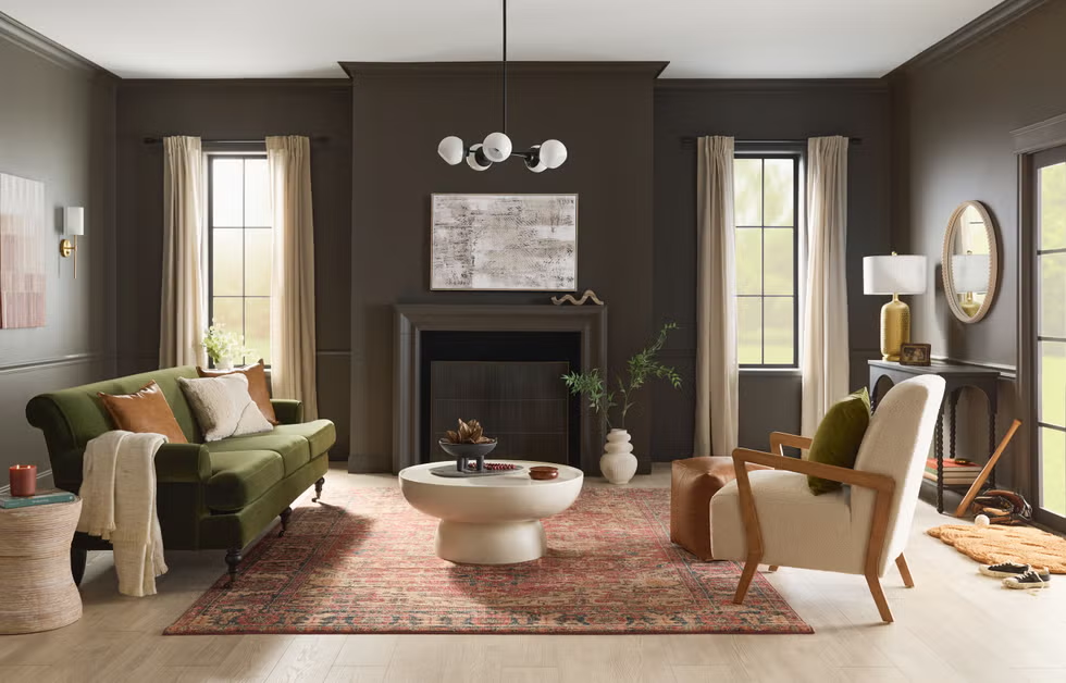
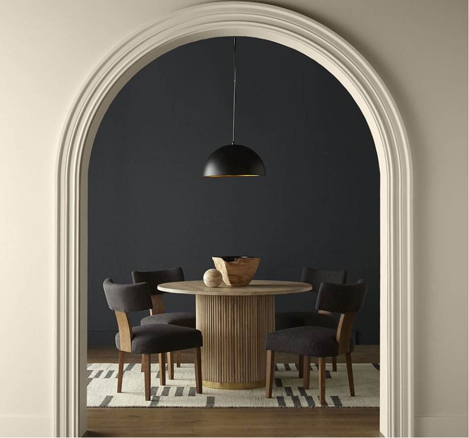
Behr choose to go a completely different direction with Cracked Pepper. This color is dark and rich. It is exactly what you think, it is a black color and brings a boldness to a room. For anyone doing video production in a room, this is a great color for a wall.
Dunn-Edwards Color of the Year
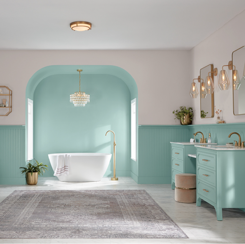
Dunn-Edwards is also choosing a blue color with Skipping Stones. This color is inspired by the sea and feelings of gratitude and magic. They suggest using this color in a space for quiet reflection.
Valspar Color of the Year
The Valspar organization is also choosing a blue color for 2024. This color is called Renew Blue. This organization is also inspired by calm and serenity in the home. They also use the word simplicity to explain the reasoning behind this chosen color.
HGTV’s Color of the Year
HGTV in partnership with Sherwin-Williams has created a similar color to the Pantone color called Persimmon. Persimmon is a peachy like color similar to that of a persimmon fruit.
Glidden Color of the Year
Glidden stays in the same calming color scheme but chooses a more yellowish color with Limitless. They may not like the fact that I called it a yellowish color, you can watch the video for more fun, but it kind of looks a little yellowish to me.
Remember painting your home or objects in your home can use these colors. You do not need to use these colors on all the walls in a room but any of these colors could be a great accent wall. Have fun and it is looks like calming is the core message for 2024.
The Power of Color: Benjamin Moore’s Paint of the Year and the Psychology of Design
6 Benefits of Using Neutral Colors to Set the Foundation for Your Home
In the ever-evolving interior design landscape, one element remains steadfast—neutral colors. From soothing beiges to calming grays, neutrals are the unsung heroes of home decor, providing a timeless and sophisticated foundation that adapts to changing trends and personal styles.
Read MoreThe Power of Color: Benjamin Moore’s Paint of the Year and the Psychology of Design
Color is one of the most important elements of interior design. It can create a mood, set the tone for our homes, and even influence our emotions.
Blue Nova, Benjamin Moore’s Color of the Year for 2024, is a beautiful blend of blue and violet that will suit any room in your home.
“Blue Nova 825 is an alluring mid-tone that balances depth and intrigue with classic appeal and reassurance,” shared color marketing and development director at Benjamin Moore, Andrea Magno.
Read More8 Tips to Effectively Use White in Your Home Decor
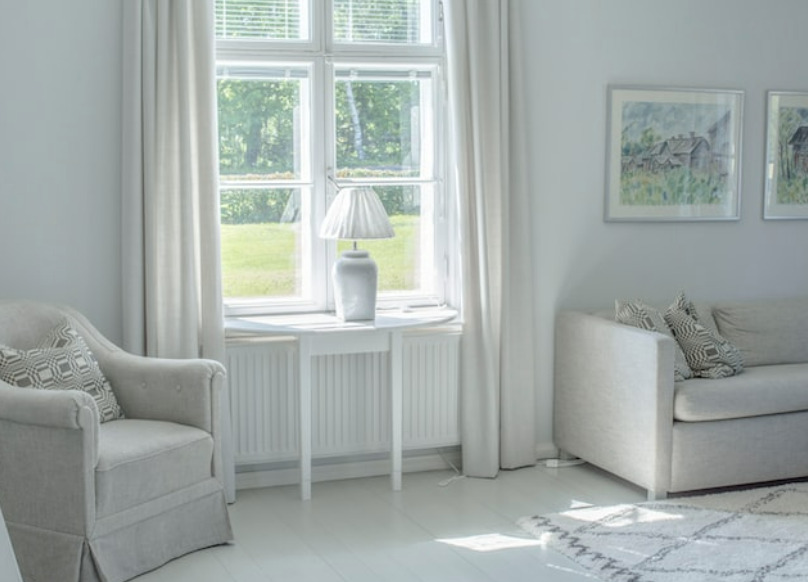
White is a timeless and classic color that has always been a popular choice for home décor. It can create a feeling of spaciousness, cleanliness, and calmness.
However, decorating with white can also be tricky, as it can easily become boring or overwhelming if not done correctly. If you’d like to add white to your home décor, here are some tips and tricks to help you use it in any space.
Read More
