The fall season is one that design enthusiasts look forward to. Why? Because this is the time of year when all of their favorite paint manufacturers reveal their Color of the Year!
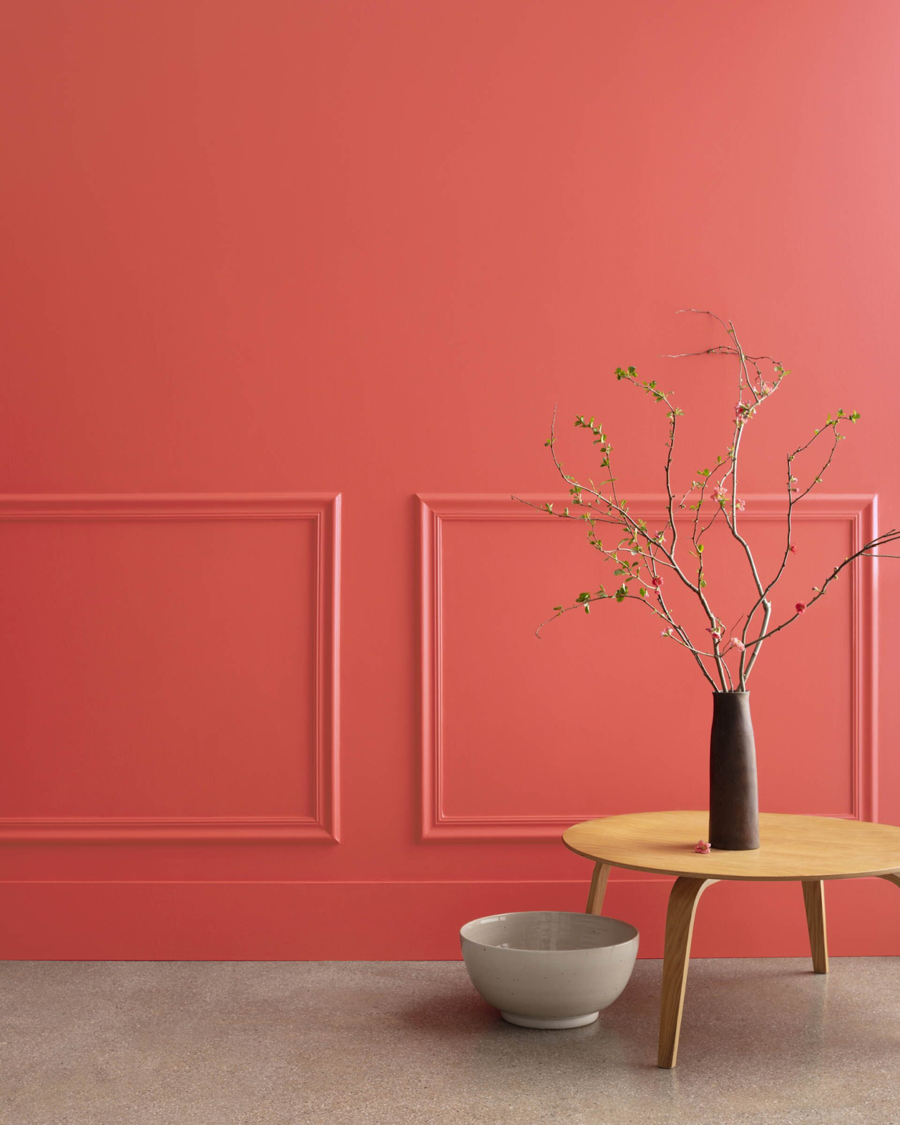
Benjamin Moore’s Raspberry Blush, a deep coral red with a hint of pink that is sure to give any space a newfound energy, is one of the new colors that have been announced for 2023.
We adore it so much that we couldn’t help but look closer.
This composite color, which is somewhere between a vivid coral, a burnt orange, and (appropriately) a raspberry pink, is dynamic and adaptable.
Raspberry Blush has been selected by Benjamin Moore as the 2023 Color of the Year. Paint in this cheery orange-red shade will instantly make your house feel happier.
Raspberry Pink is a strong pinkish hue, but there are many ways to use it in your home. Of course, you can incorporate this coral pink shade into your home with bold wall art or furniture.
But why not be a little more daring? Since Raspberry Blush is already a striking color, why not go all out?”
Why did the paint manufacturer choose such a bold color?
Benjamin Moore has noted that people’s relationships with their homes have changed. Their homes are becoming more important than ever, due to the increase in remote work or simply because they’re spending more time at home, so they’re more invested in living in a beautiful space.
Everything is getting much bolder as people make their homes even more personal for themselves. Recent years have seen a rise in warmer and bolder colors in our homes. So it came as no surprise that Benjamin Moore’s Color of the Year would be a deep, warm red shade.
Colors that work well with Raspberry Blush
Pairing this sophisticated color with soft pink and teal is ideal. You need a different color to serve as a contrast when using Raspberry Blush. It will be lost if you place it, for instance, in a midtone. When compared to the vividness of the bright red, the other color will appear less saturated.
If you prefer a more subdued aesthetic, Raspberry Blush pairs well with either neutrals or paler pinks. It can be used more subtly as an accent or as a feature to add a splash of color.
Depending on your personal level of confidence, you can really turn it up or down. If using a neutral, choose a warm undertone primary color and accent it with raspberry blush.
Lighting that works well with Raspberry Blush
We are all aware that a room’s natural lighting greatly affects how the colors on our walls actually appear. You’ll be happy to learn that Raspberry Blush is a warm color that can look stunning in most lighting situations.
While a warm color in a south-facing room doesn’t become anything other than warm, a warm color in a north-facing room feels nice and cozy.
However, in order to fully appreciate the complexity of this color, it would be more appropriate to use it in a warm color scheme in a south-facing room. When it comes to color, raspberry blush falls somewhere in between red and orange.
Given that it is one of these composite colors, a room with good lighting will allow you to appreciate its complexity a little more than a room with a north-facing orientation. Using the color in such a room will make the dynamic interaction of the light with the color and its undertones more noticeable.
Can Raspberry Blush be used in any room?
There are many reasons to love this color, but it’s important to pick the right space. This light-hearted color has a friendly and enjoyable vibe that fits in well with social spaces like the kitchen.
The concept behind Raspberry Blush, according to Helen, was to create a more contemporary version of the deep heritage reds found in formal dining rooms.
Although this color is more modern, it still exudes the warmth and coziness that we look for in a dining room. Use it in a dining room with intimate seating to create the ideal space for entertaining guests.
Which style works best for you, bright and bold or quiet and understated?
Tracking your Paint Colors in HomeZada